Pensford's original website was quite difficult for users to figure out and didn't establish their brand as industry leaders. My goal with this project was to create a new design system that had clear paths for users to follow while building their brand as leaders in their industry.
Pensford's previous website didn't allow users to easily navigate the site to find essential resources offered by Pensford. The design also didn't do an excellent job of establishing Pensford as leaders in their industry.
After researching competitors' websites and conducting user journey maps based on personas and analytics of the old site, I found the four most visited resources and decided they would be great candidates for the four quick links on the homepage.
My solution was to redesign the website to fix this problem. Main fixing points included quick-links on the homepage hero, a dashboard of financial data on the homepage, and a design that set them apart from their competition.
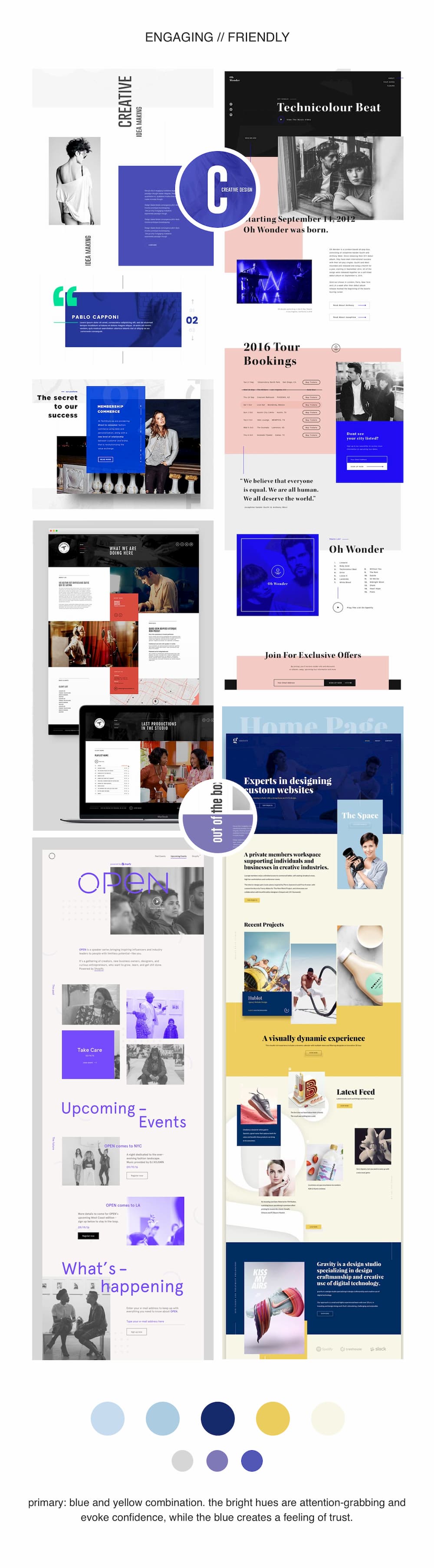
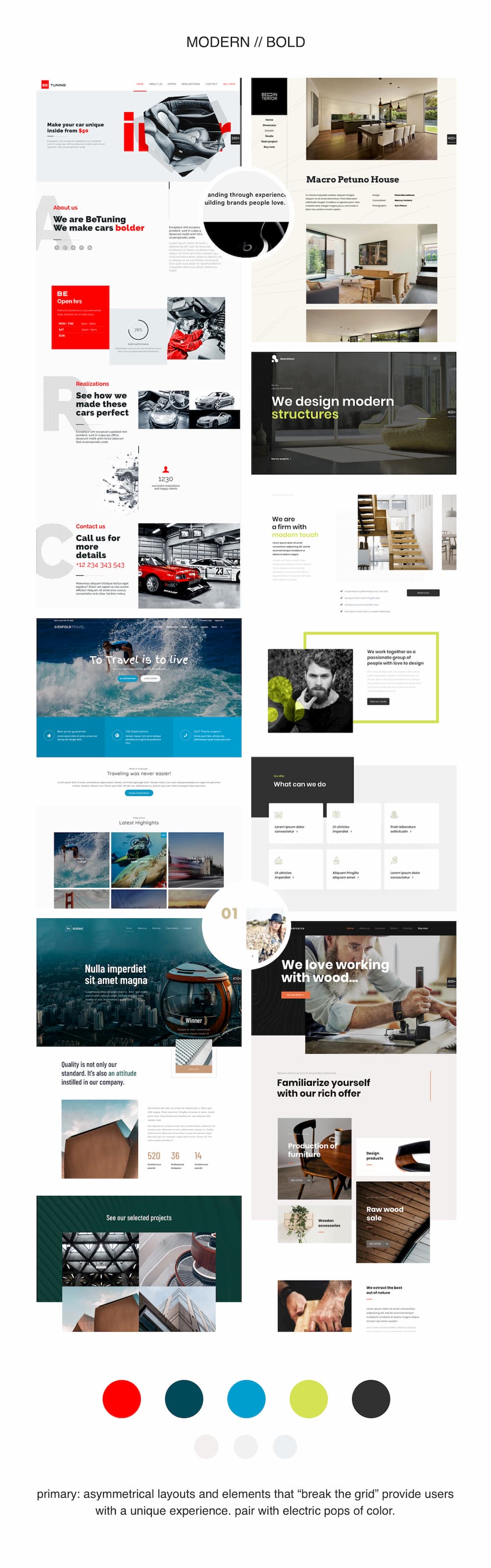
I gathered inspiration from several best-in-class financial data websites. Creating a design that would be cohesive with Google's Material Design standards was also taken into consideration. These sources of inspiration for the new Pensford website would inform a design that is simple and known to work for its users.

I created two website wireframes and conducted user tests to find out which wireframe option would yield the best results in terms of the user journey. It became clear that the option with four quick links in the homepage hero area helped customers get to vital parts of the website the fastest.

I designed the website using Sketch and prototyped it in Invision so users could experience the site before being built on the web.

After the new design launched, the bounce rate of the website decreased by 30%. In addition to this, newsletter sign-ups increased by over 500 people within the first six months.