HORRID Magazine is a Denver based magazine that showcases dark art photography in a monthly printed zine. They needed a web solution that allowed users to purchase monthly and yearly subscriptions. Finding a solution to their problem was a bit of a challenge, but I was able to figure something out that has yielded some impressive results.
The client needed a web based platform that allowed users to purchase magazine subscriptions, sign up for email newsletters, and submit work to be featured in the magazine. They also wanted a website that could showcase their brand in a more meaningful way than their previous platform, Patreon.
When conducting research, I noticed that there weren't a lot of great websites for art zines that allowed users to subscribe and purchase back issues. I found a lot of zines were using a platform called Patreon. This platform didn't allow much customization, though, which I felt was an essential aspect of selling products. I decided that I would build a custom e-commerce website that could handle monthly and yearly subscriptions while still being able to represent the brand correctly. I'm currently in the process of researching the current site to see what can be done to more effectively sell products. So far, everything is going smoothly, and about three new subscriptions are purchased weekly.
I used Webflow, Foxy.io and Mailchimp to create an online platform that could handle all of this. I designed the site using animations, styles, and effects that would represent HORRID. The new website connects with their audience in a much more meaningful way.
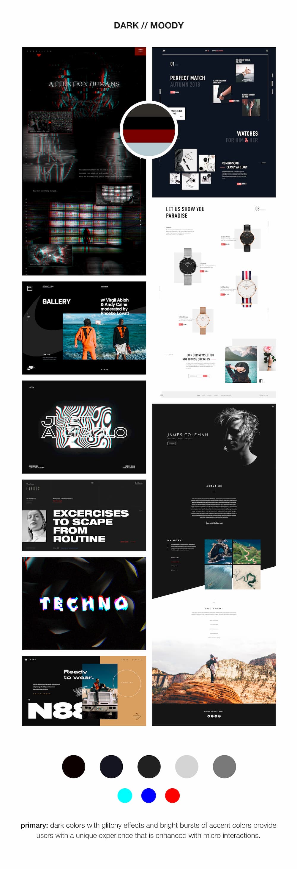
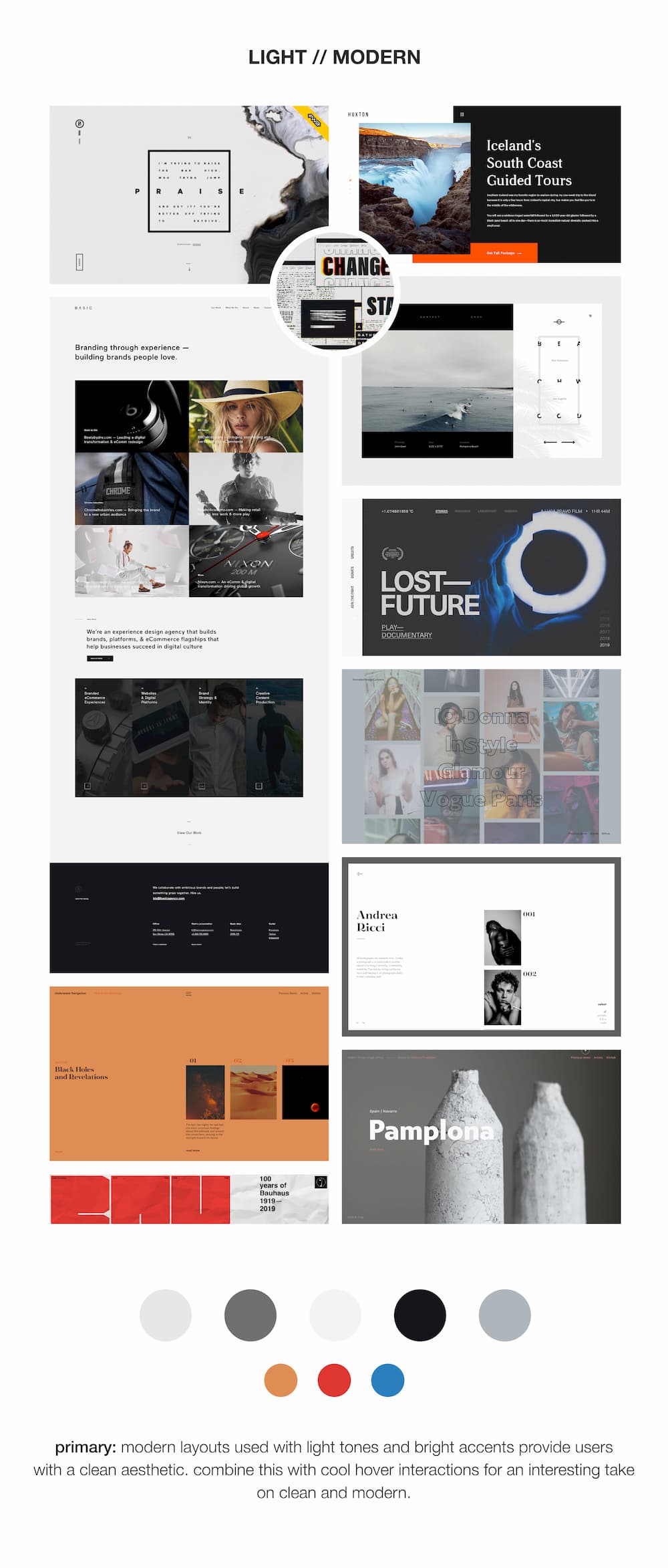
Because HORRID is a dark art zine, I wanted to convey the brand in a really neat way. The part of the process of redesigning a website is crucial to understanding how a client should be perceived by their audience. So, in order to get the best results, I created a series of moodboards with different vibes/styles and we worked with a select group of HORRID subscription members to narrow down a theme that would work best for the website.

In this phase, I designed wireframes for the website and worked with a select audience to try and nail down a good flow for users that could get them from point A to point B efficiently. I created three personas, one for someone trying to purchase a magazine, one for someone who is trying to become a monthly subscriber, and one for someone who wanted to subscribe to the email newsletter. On critical pages of the website, I made sure that these three actions are easily accessible within the first 10 seconds of visiting.
.jpg)


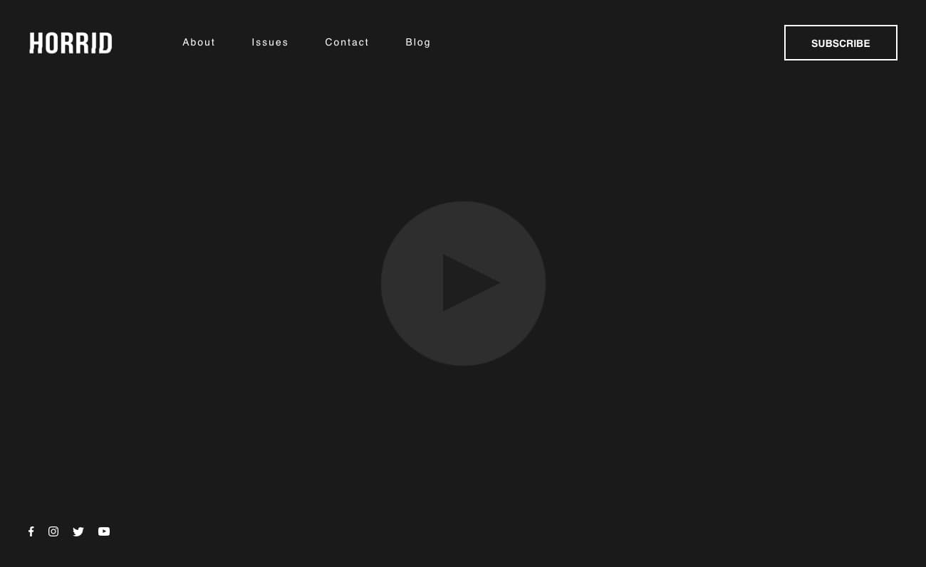
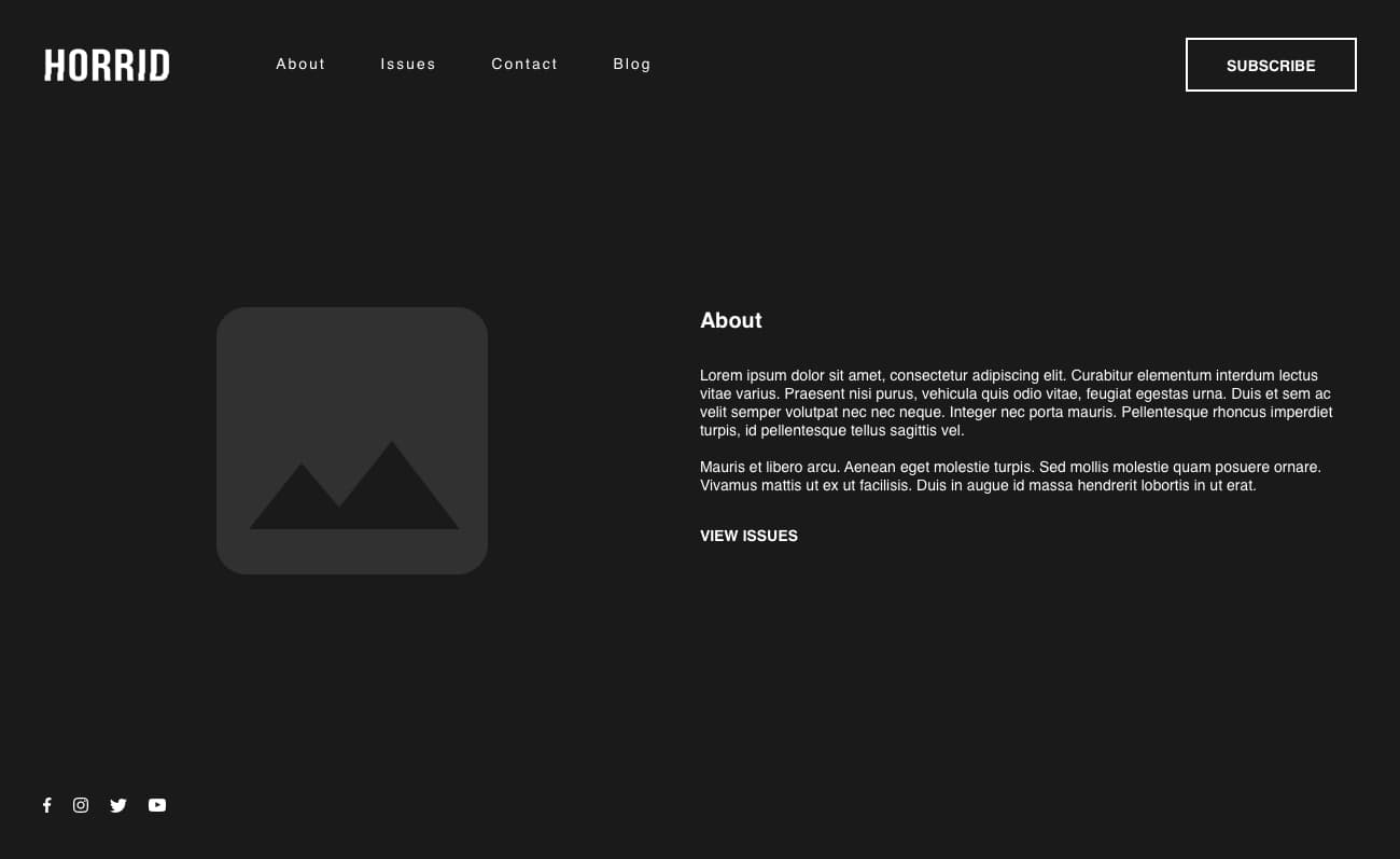
Because the wireframes I created were so effective when tested with users, I designed the website prototype right on Webflow. This saved me time in the end and also allowed me to perform prototype testing earlier on in the design process. This stage of my process is always fun because I get to bring the website to life. Thanks to Webflow, I was able to do things that I never would have been able to do before by creating interaction animations, and glitchy effects throughout the site. When tested by users, they unanimously agreed that the website not only represented the brand of HORRID, but also elevated it to a place that exists within the minds of the creators of the zine. On top of that, the ease of use for purchasing issues and subscribing has helped gain a lot of monthly and annual subscribers.

Since launching on July 13, the amount of HORRID magazine subscribers has increased by over 200% from when they were using Patreon. The email list has grown to over 50 subscribers and continues to grow weekly. Traffic to the website has been consistent. Overall, the client and its customers have been extremely happy with the website. I'm currently conducting some user tests to see if there can be improvements to the site, but so far the three key purposes or journey maps are the most frequently visited routes through the site.